Each year we learn something new about graphic design and 2016 was no different; I decided to make some predictions for 2017 design trends, so let’s get started!
Design trends are determined mostly by media, technology, social influences, and usability.A trend usually emerges two ways: slowly, gradually making its way into all design branches, or abruptly. Gradual or abrupt, trends tend to fade out in the same manner as they appear. Historically, design trends live no longer than one to two years, however, some trends may reappear a few years down the road.
Design in 2017 will continue to progress and many of 2016’s design concepts are still as popular as ever. A few new and notable concepts are making their way into the forefront of design. I hope to guide you in embracing new design challenges and, hopefully, get a leg-up on your competitors.
Here’s a look at 3 new 2017 design trends becoming vogue.
1. Louder and Brighter Colors
Over the past few years, many tech leaders have leaned towards muted, neutral and safe colors. One company that has successfully used this design trend is Apple. Their most recent branding campaign focused on creating a clean and controlled design scheme. This notion of a sleek, simplistic, functional future is the same design concept that most of us have recently seen in science fiction movies as well as showing up in recent modern art movements.
This design style initially worked for Apple, but has lost it’s novelty with market saturation as other products jumped on the bandwagon. We may see this trend come back in the future with a twist.
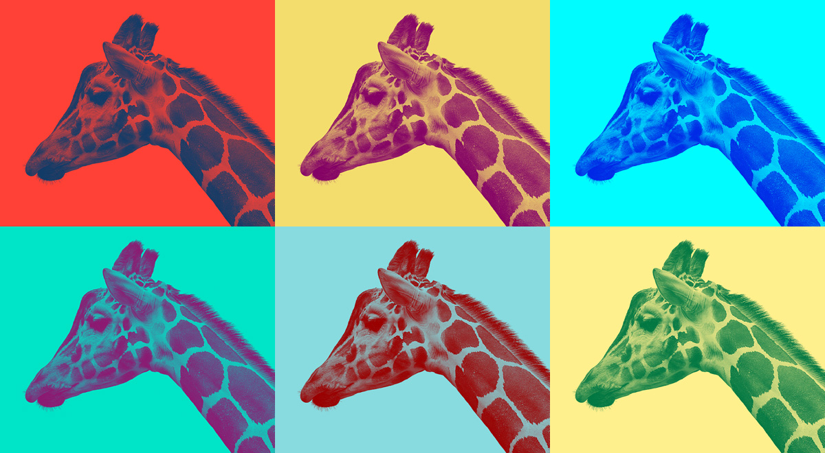
Meanwhile, design is shifting away from neutral colors and towards bolder and brighter colors with favorites including various hues of purple, yellow, and pink. Spotify and Instagram are two successful examples applying this idea. Both began using this trend in late 2016 and now are leading the pack, using bold colors mixed with gradients to create designs such as duotones.
Duotone is a halftone reproduction of an image using the superimposition of one contrasting color halftone over another color halftone. Basically, they combine two colors most often using bright or contrasting colors. This idea is my personal favorite use of color. I encourage you to find room to have fun with this trend in your 2017 design plans.
2. Geometric Shapes and Layering
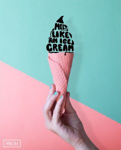
In 2017, we have also seen a new way to layer elements: geometric layering. This trend surfaced a while back, but doesn’t seem to be fading soon. It is classy, clean, and achieves dramatic, eye-pleasing compositions. Geometrics are easy to combine with other current design trends including bright colors and typography. Layering geometrics adds visual interest to designs: think 80’s clothing fashion.
We are seeing designers using this trend for framing by using bold shapes to bring new life to basic images (buildings, people working, a business meeting). In addition to the fun shapes, cut-outs, and bold color, the design starting point is relatively easy to find. In the example below, notice how geometric shapes are used to effectively move the user from a shape to important content such as a headline or branding image.
3. Typography
Typography is a staple for all design. Combining different families of fonts is not a new design concept, however, 2017 brought on a creative new way of combining fonts with images.This trend definitely has a place as one of my preferred design elements for this year.
This trend is easy to include in designs with prominent elements of a single letter or single image wrapped in text. Look for this trend to stick around as typography has consistently gained popularity among designers.
Here are a few brave and inspiring graphic designs featuring typography elements including bold print, tiny print, and typography inside of photography.
In conclusion, the driving force of design this year is resistant to the overly clean look that the technology gurus have used in the past few years. 2017 has taken a whole new approach including the intense, innovative, and beautiful. As in recent years, these trends will be most innovative with top tech companies such as Spotify, Google, and Apple due to their bandwidth, budget and talent. They pave the way for winning graphic design ideas we can use here at home.
