A Landing page is used to persuade users to take a specific action(aka conversion). If used correctly, it can be a powerful tool for marketing, sales, lead generation, and building your customer base. On the web today, landing pages are underutilized and under-tested (only an estimated 50% of landing pages are optimized after implementation).
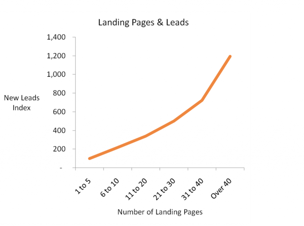
According to market research, increasing the number of landing pages you have exponentially increases leads. For example: a business with 15 landing pages, produces an estimated 55% more leads than a business with only 10 landing pages and a business that uses over 40 landing pages generates an estimated 12X more leads than businesses with only 1-5 landing pages.
Creating a landing page is not rocket science, but there is a science to it. Although there is no magic formula to creating a perfect one-size-fits-all landing page, most landing pages are made using some basic building blocks. Although there are always exceptions, the basic landing page usually consists of a headline, a subheading, some supporting text(keep it short), an image or video, and some kind of Call to Action(CTA).
Generate More Leads: The Layout
The layout of the page should be fairly simple and uncluttered. This will guide the user through the page and direct them to the action you want them to take. Most landing pages will have a Call to Action that is visible without scrolling down the page(above the fold) and the headline and supporting text are very brief and to the point. If the landing page needs to convey more information or requires more space to make a more compelling case to the user, the call to action may be presented after scrolling down the page a short distance.
With the right content and subject matter, the longer landing pages have the potential to convert more customers than traditional landing pages above the fold. If you want the user to be directed down the page, the text on the page should be largest at the top with the headline and get smaller as it goes down with the subheading and supporting text.
Generate More Leads: The Content
Background images can provide a simple, yet effective, backdrop on a landing page. The human brain can process information from an image much faster than text content. Using a large background image can give you the opportunity to influence the user with a good first impression before they have a chance to read any of the text. It is critical to choose a background image that will positively reinforce the message you want to convey.
The text on your page should positively reinforce your message with words that convey trust and quality. It is good to use words like Certified, Backed, Authentic, Dependable, Guaranteed, etc. Some words you should avoid on landing pages include: Click Here, Totally, Basically, Essentially, Cheap, etc. The copy on the page should not consist of lengthy paragraphs or drawn-out sentences. The offer should be more than 3 sentences. The benefits should be formatted in bullet points or short concise statements that don’t add bulky text content.
The form on the page should be short and easy to fill out. Avoid fields that do not pertain to the offer at hand. The user will shy away from filling out a form if it asks for information that is too personal or too time-consuming. The form on the page or CTA should use an action word other than submit. If you trying to compel the user to use a service, then you might use GET STARTED or START SERVICE.
Conclusion
Landing pages will help your business grow and reach a specific audience without changing your whole website. A good landing page does take some careful thought and planning. It’s worth it though. They offer a significant advantage because they are relatively easy to build and implement while being effective.
——————————————————————————————


